
Common Engagement Gaps in SaaS Websites
Unclear messaging, slow performance, generic content, and missing trust signals are the primary engagement gaps draining SaaS conversions.

- Confusing Messaging: Visitors leave when they can’t quickly understand what your product does or how it helps them. Overuse of jargon and feature-focused language are common culprits.
- Slow Load Times: A slow website creates a poor first impression. Pages taking over 3 seconds to load can drive users away before they engage.
- Generic Content & Complex Navigation: One-size-fits-all content and cluttered user paths frustrate visitors, reducing conversions by up to 50%.
- Missing Trust Signals: Lack of client logos, testimonials, or security badges makes users hesitant to engage or purchase.
Solutions That Drive Results:
- Use clear, customer-focused messaging.
- Optimize website speed and mobile usability.
- Personalize content and simplify navigation paths.
- Add trust elements like case studies, badges, and transparent pricing.
Why It Matters: Closing these gaps can boost conversions, lower customer acquisition costs, and increase revenue. Tools like competitor analysis can help you identify and fix these issues quickly.
Gap 1: Unclear Messaging That Fails to Communicate Value
How Poor Messaging Reduces Engagement
When someone visits your SaaS website, they’re making snap decisions about whether your product solves their problem. If your messaging is too vague, overly technical, or just plain forgettable, they’ll bounce before you’ve had a chance to show them why you’re the solution they need.
Here’s how you know there’s a problem: prospects misunderstand what your product does, or even engaged users can’t explain who it’s for. If you’re getting misaligned inquiries, it’s likely your copy is confusing or off-target.
A common culprit? Feature-first language. This type of messaging focuses on what your product does rather than what it delivers. It’s also a red flag if your website fails the “logo swap” test. Natalia Slota from Apricot B2B explains it perfectly:
"If you removed your logo from your homepage right now, would buyers know they were looking at your company? Or would they assume they'd landed on a competitor's site?"
Another issue is relying on jargon - terms like "leverage", "robust", or "seamless" might sound polished but don’t resonate with most customers. Instead, use straightforward, customer-focused language to speak directly to the challenges your audience is trying to solve.
Identifying these weak spots in your messaging is the first step toward meaningful improvement.
Solution: Improve Messaging Using Competitor Data
Fixing unclear messaging starts with analyzing your competitors. By studying their language, you can spot overused phrases and uncover the gaps they’re leaving unaddressed. The goal isn’t to copy them - it’s to find the opportunities they’re missing, such as untapped use cases, overlooked customer segments, or emotional triggers like trust and time savings.
Tools like Competitor Analysis Tool can help you compare your messaging to theirs, highlighting where your copy falls short. This data-driven approach shifts your website from being just a design project to a powerful tool for conversions.
Start by reviewing competitors’ headlines and value propositions. Then, dig into customer reviews on platforms like G2 or Capterra. These reviews often reveal the exact words customers use to describe their "aha" moments or the outcomes they value most. For instance, instead of using internal terms like "Advanced Analytics Dashboard", reframe it with customer language: "See exactly which campaigns are making money". This simple shift from features to benefits can lead to double-digit conversion rate improvements - without touching your site’s design.
Don’t stop there. Address the main reasons potential customers might switch to your product. For example, a message like "Still using spreadsheets for payroll?" speaks directly to their frustrations with current solutions. Tackle concerns like setup complexity, integration headaches, or how quickly they’ll see results. By being direct and customer-focused, your messaging can inspire action and make a stronger impact.
Gap 2: Slow Website Performance and Poor User Experience
How Slow Load Times and Mobile Issues Drive Users Away
Website speed is often the very first impression visitors get of your product. A slow-loading SaaS site can instantly give off the impression that the software itself might be clunky or unreliable. This can lead users to form a negative opinion before they even get to see your value proposition.
The numbers paint a clear picture: A site with a 1-second load time achieves conversion rates three times higher than one that takes 5 seconds. And for B2B lead generation, the difference is even more stark - a 1-second load time can result in five times the conversion rate of a 10-second load. Even a seemingly small delay of 100 milliseconds can reduce conversions by roughly 7%.
One common issue is that many SaaS sites are designed for desktop and then simply resized for mobile. This approach often leads to poor mobile usability, such as small tap targets, navigation that only works with hover actions, and intrusive modals. Over half of mobile users will abandon a page if it takes more than 3 seconds to load. And bounce rates? They skyrocket from 9.6% for sites loading in 1–2 seconds to 38% for those taking 5 seconds or more.
A June 2025 analysis by Catchpoint highlighted these issues with real-world examples. Tableau, for instance, loaded a complete page in just 1.1 seconds, using only 19 resources (8 JavaScript files) and maintaining excellent layout stability. On the other hand, ClickUp took a frustrating 9.6 seconds to load, weighed down by 144 resources, including 115 JavaScript files. Despite having fast backend responses, ClickUp's excessive client-side rendering created a sluggish user experience.
The consequences are severe. Nearly 79% of users who encounter performance problems are unlikely to return or make a purchase from the same site. As Andy Crestodina from Orbit Media puts it:
"Web pages don't have loading bars. So when the page is slow, the visitor doesn't know if the delay will be another 500 milliseconds or 15 seconds. Maybe it will never load. And the back button is right there".
These challenges, uncovered through competitor benchmarking, emphasize the need for targeted improvements.
Solution: Speed Up Your Website and Fix Mobile UX
To address these issues, start by benchmarking your site's Core Web Vitals and load metrics against industry leaders by analyzing competitor websites. Google's Core Web Vitals provide three key benchmarks: Largest Contentful Paint (LCP) should be under 2.5 seconds, Interaction to Next Paint (INP) under 200 milliseconds, and Cumulative Layout Shift (CLS) below 0.1. Meeting these standards can improve user engagement by as much as 70%.
Here are a few actionable steps to improve site performance:
- Optimize images by using modern formats like WebP or AVIF.
- Defer non-critical scripts to prioritize essential content.
- Define explicit width and height attributes for images and videos to prevent layout shifts.
Mobile usability is equally important. In February 2025, StanVision audited a B2B tool and found that while 58% of its traffic came from mobile devices, only 22% of trial users were converting. The culprits? Tiny 12-pixel links and hover-only menus. After redesigning the mobile hero section and increasing tap targets to at least 44 pixels, mobile trial starts jumped by 31%, and bounce rates dropped by 19% - all within three weeks. As Stan Kirilov, Experience Director at StanVision, explains:
"If your hero isn't usable in the first 2 seconds on mobile, the rest of the page doesn't matter".
Speed is particularly critical for high-intent pages like pricing, login, and checkout. Slow load times on these pages can erode trust and drastically reduce conversions. For international audiences, consider implementing a global Content Delivery Network (CDN). Without one, users in regions like the Middle East and Africa might face wait times 2.5 times longer than those in North America.
Competitor benchmarking can guide these improvements. Use tools to compare your site's load times, mobile responsiveness, and Core Web Vitals scores against top-performing competitors. This data-driven approach ensures that your fixes are targeted and effective, ultimately driving better conversions.
Gap 3: Generic Content and Complicated User Journeys
Problems with One-Size-Fits-All Content and Complex Flows
After addressing messaging and performance, the next step is refining content and simplifying user journeys to keep visitors engaged.
When your messaging is too generic, visitors struggle to see how your product fits their needs. Phrases like "intelligent solutions" make users work harder to figure out the relevance, which often leads to frustration and quick exits. In fact, unclear first impressions can reduce conversion rates by as much as 30% to 50%. And since visitors form opinions in seconds, concise and clear copy can make all the difference. If your homepage is filled with jargon or a laundry list of features, users are likely to leave before they even explore further.
Overly complicated user journeys make things worse. Websites that bombard visitors with too many options - like "Book a Demo", "Start Free Trial", and "Watch Video" all on the same page - create decision fatigue. This friction often leads to abandonment. On top of that, 33% of SaaS websites fail to include industry-specific pages, leaving users unsure if the service will meet their professional needs. Hiten Shah, Co-founder of Crazy Egg, puts it plainly:
"If your site or app is disorganized, then no amount of beautiful images is going to save it. Users will get lost, confused, and ultimately leave, probably to a competitor."
The numbers back this up. While 50% of marketers focus on top-of-funnel content, only 14% create material for the bottom of the funnel, which is where users need specific answers to make decisions. This imbalance leaves potential customers wandering through generic pages, unable to find the information they need.
These challenges highlight the importance of creating personalized, user-focused content and navigation.
Solution: Add Personalization and Simplify User Paths
Your site should be organized around what users want to achieve, not how your product is structured internally. Start by replacing vague headlines with clear, results-driven statements. For example, use a formula like "[What you do] for [who you do it for] so they can [specific outcome]" to instantly convey relevance.
Personalized calls-to-action (CTAs) perform 202% better than generic ones. Implement role-based or industry-specific navigation to help users quickly find what matters to them. A great example comes from private cloud provider Dynascale. By organizing their site into categories like Solutions, Services, and Industries, and adding transparent pricing comparisons, they made it easier for enterprise prospects to find the right information. This approach, led by Lead Designer Anna Demianenko at Lazarev.agency, also helped reduce pricing objections during discovery calls. As Demianenko explains:
"Narrative architecture is our way of translating raw tech into human stakes. If your story can't pass the 'so-what' test, no amount of UI polish will save it."
Simplify user paths by focusing on one primary action per page and removing competing CTAs. Introduce product details gradually - start with 8–12 key features and provide expandable sections for more information. Add tooltips on pricing pages to clarify technical terms, sparing users the need to leave the page for explanations.
Interactive demos are another game-changer. They convert at twice the rate of traditional "book a demo" CTAs because they let users experience the product right away. Replace static screenshots with clickable walkthroughs that showcase your actual interface. This approach not only speeds up the path to the "first moment of value" but also demonstrates confidence in your product.
To identify where your site’s user journeys fall short, use tools like the Competitor Analysis Tool. It allows you to benchmark your navigation and content clarity against competitors, revealing gaps in your messaging and highlighting areas for improvement. By analyzing navigation structures and user flows side-by-side, you can pinpoint friction points and make targeted changes that drive user action.
Gap 4: Lack of Trust Elements and Disorganized Content
How Missing Trust Signals and Poor Organization Hurt Engagement
Even if your site has clear messaging and smooth navigation, the absence of trust signals or poorly organized content can still push visitors away. Trust signals are essential - they give users confidence in your company’s legitimacy. Without them, visitors may perceive your site as risky and leave. It’s that simple.
The data backs this up. About 43% of B2B buyers make conservative purchase decisions over 70% of the time, actively searching for reasons not to buy. Additionally, a staggering 82% of users will abandon a site flagged as "Not Secure", and it takes just 50 milliseconds for someone to judge your site’s credibility based on its design. If your site lacks client logos, verified reviews, or security badges, you’re essentially asking users to trust you blindly - and most won’t.
Disorganized content only makes things worse. For example, 93% of SaaS sites fail to link the features in their pricing matrix to detailed feature pages, leaving users frustrated and unsure of what they’re getting. Even worse, 25% of sites hide features behind "View More" links, which often leads prospects to assume those features don’t exist at all. When users can’t quickly find what they need or understand how your product fits their needs, they simply leave. Stuart L. Crawford from Inkbot Design sums it up perfectly:
"Trust signals aren't decorations you hang on your website. They result from being a competent, transparent, and professional business."
Poorly designed pricing tables are another common issue. Around 44% of SaaS sites have pricing matrices with mediocre usability, and 15% present dense, text-heavy layouts that make it hard for users to compare plans or understand what they’re paying for. When clarity and ease are lacking, users will look elsewhere.
Solution: Add Trust Elements and Reorganize Content
Without trust signals and clear organization, you’re not just confusing users - you’re eroding their confidence in your brand. To fix this, you need a structured approach, often referred to as a "Trust Stack."
The Trust Stack has four key layers:
- Authority: Include certifications, awards, and partner logos.
- Evidence: Showcase verified testimonials and detailed case studies.
- Assurance: Offer money-back guarantees and clear service-level agreements (SLAs).
- Transparency: Display team photos, contact details, and straightforward privacy policies.
Strategically place these trust elements where users are likely to hesitate. For example, add testimonials or security badges next to your primary call-to-action buttons to provide an instant confidence boost. On pricing pages, include a short FAQ to address common concerns, and near contact forms, use reassuring microcopy like "No credit card required" or "Response within 1 business day".
To improve your pricing matrix, make it user-friendly. Add sticky headers so plan names stay visible while scrolling. Link every feature in the matrix to its corresponding detail page - Xero does this well - so users aren’t left searching for explanations. Use tooltips to clarify technical terms right where they appear, following Avast’s example. Avoid hiding features behind "View More" links; instead, display the full list and group related items under clear subheadings, as Canva does.
Another trust-building strategy is to showcase your product interface. Surprisingly, 20% of SaaS sites fail to effectively present their UI, leaving prospects unsure of what they’re buying. Use screenshots, animated GIFs, or interactive demos to give users a clear preview of your product. This transparency reduces perceived risk and helps users decide if your product is right for them.
To identify which trust elements and organizational changes will have the biggest impact, use tools like the Competitor Analysis Tool. This tool allows you to compare your site’s trust signals and content structure against industry leaders. By analyzing navigation clarity, credibility markers, and information layout, you can prioritize changes that directly address user doubts and improve engagement.
5 approaches to improve website conversion rates by optimizing the hero
Measuring and Fixing Engagement Gaps
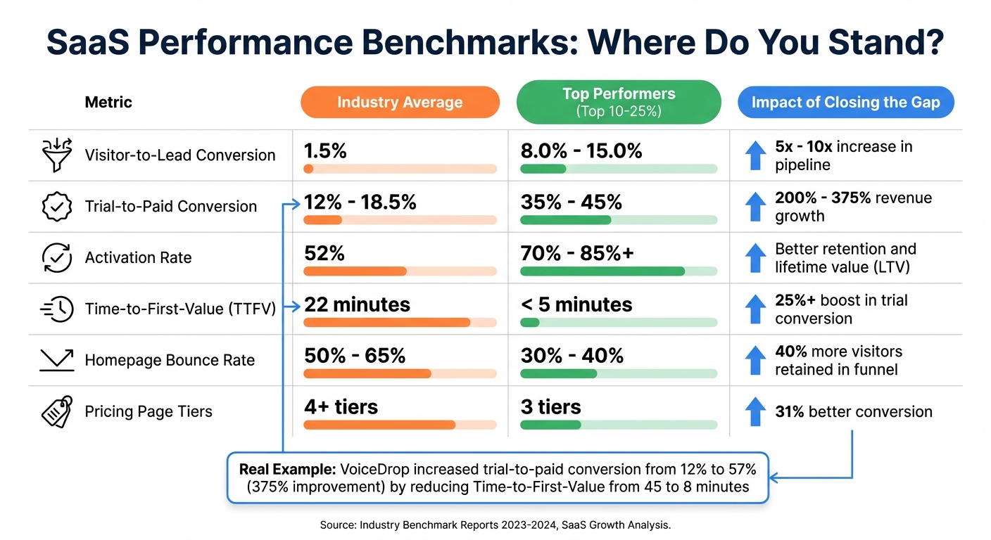
SaaS Website Performance Benchmarks: Industry Average vs Top Performers
How Engagement Gaps Affect Revenue
Engagement gaps can be a direct drain on revenue. For instance, imagine a SaaS company with 50,000 monthly visitors and an average deal size of $2,000. If that company improves its visitor-to-lead conversion rate from 1.5% to 6.0%, it could generate over $5 million in Annual Recurring Revenue (ARR). On the flip side, inefficient processes can cost companies an average of $1.39 million annually.
Even small inefficiencies can snowball into significant losses. Larry Jacobs, Owner at FuseDemand, describes it this way:
"Your marketing team is probably great at generating leads. But if those leads are leaking out through broken processes, you're just working harder to replace the revenue you should already have."
Operational inefficiencies don’t just cost money - they cost time. Delays in delivering the "aha moment" can reduce conversions by about 8% for every 10 minutes of delay. And when 70% of SaaS companies lose buyers due to unclear website copy or 35% of users abandon signups because of excessive form fields, it’s clear that these gaps are bleeding potential customers at every step.
By benchmarking your metrics against industry standards, you can identify exactly where to focus your efforts for the greatest revenue impact.
Competitor Benchmarking Metrics Table
Here’s how your performance might stack up against industry benchmarks:
| Metric | Industry Average | Top Performers (Top 10-25%) | Impact of Closing the Gap |
|---|---|---|---|
| Visitor-to-Lead Conversion | 1.5% | 8.0% - 15.0% | 5x - 10x increase in pipeline |
| Trial-to-Paid Conversion | 12% - 18.5% | 35% - 45% | 200% - 375% revenue growth |
| Activation Rate | 52% | 70% - 85%+ | Better retention and lifetime value (LTV) |
| Time-to-First-Value (TTFV) | 22 minutes | < 5 minutes | 25%+ boost in trial conversion |
| Homepage Bounce Rate | 50% - 65% | 30% - 40% | 40% more visitors retained in the funnel |
| Pricing Page Tiers | 4+ tiers | 3 tiers | 31% better conversion |
The potential gains from closing these gaps can be transformative. Take VoiceDrop, a voice message automation company, as an example. In August 2025, under the leadership of Robby Frank, the company tackled its engagement issues. They reduced Time-to-First-Value from 45 minutes to just 8 minutes, replaced calendar-based payment requests with milestone-based triggers, and simplified their signup form from 7 fields to 3. The results? Their trial-to-paid conversion rate skyrocketed from 12% to 57%, a 375% improvement. Monthly revenue jumped from $6,258 to $29,800, and Customer Acquisition Cost (CAC) dropped from $285 to $60.
If you’re unsure where your biggest gaps are, tools like the Competitor Analysis Tool can help. This tool evaluates key factors like messaging clarity, page speed, and conversion paths, then prioritizes fixes based on their potential revenue impact. By identifying exactly where you’re losing ground compared to competitors, you can focus on the changes that will make the most difference.
Conclusion: Closing Engagement Gaps for SaaS Growth
Engagement gaps go beyond design flaws - they can seriously impact your bottom line. When your messaging is unclear, your site is slow, your content feels generic, or trust signals are missing, users are more likely to leave. And when users leave, so does potential revenue.
The good news? These gaps can be addressed, and the results are measurable. Fixing them not only reduces customer acquisition costs (CAC) but also increases customer lifetime value (CLTV) and improves conversion rates. As WebEngage puts it:
"Value is the paramount pillar of everything we do in business – it always was and it always will be".
Removing friction and focusing on delivering value efficiently creates the perfect environment for better engagement.
One of the smartest ways to tackle these gaps is by learning from competitors. Instead of guessing what might work, you can analyze what’s already working for others. Successful SaaS websites offer a roadmap - they show how to structure messaging, build trust, and streamline user experiences. As Seeto explains:
"If you read a competitor's site as 'design', you see aesthetics. If you read it as 'data', you see strategy".
This is where tools like the Competitor Analysis Tool come in handy. It compares your website to your competitors, analyzing factors like messaging clarity, conversion paths, and visibility gaps. In just two minutes, it highlights areas to improve and prioritizes fixes based on their potential revenue impact - no SEO expertise required.
Engagement isn’t just a feel-good metric - it’s a key predictor of growth. High engagement during trials often leads to conversions, and keeping users engaged after signup drives retention and expansion revenue. By systematically addressing these gaps, you create a solid foundation for sustainable, scalable growth.
FAQs
Which engagement gap should I fix first?
Visitors landing on your site should immediately grasp what you’re offering - ideally within 5 seconds. If your value proposition or messaging is unclear, they’ll likely leave before exploring further. To keep them engaged and reduce drop-offs, focus on delivering a message that’s both clear and concise. This quick clarity is a key ingredient in improving conversions.
How can I tell if my homepage messaging is unclear?
Your homepage might be missing the mark if visitors can’t grasp what your product does, who it’s meant for, and why it’s important - all within 7 seconds. If you’re noticing high bounce rates or realizing that key questions about your value proposition aren’t being answered, it’s a sign your messaging needs work. Clear communication keeps visitors engaged and helps them connect with what you’re offering.
What trust signals matter most on a SaaS pricing page?
The most effective trust signals for a SaaS pricing page include customer testimonials that highlight specific outcomes, third-party reviews to add impartial credibility, and security badges that reassure users about data protection. Additionally, clear guarantees, such as a 30-day money-back option, and transparent information addressing potential concerns can go a long way in building trust and minimizing buyer hesitation.